Showing posts with label pod. Show all posts

1 Nov 2012

Same difference (36)

'Same difference' is an irregular feature I do whenever I come across two or more covers that share a cover model or item.


Skyship academy book two
And
(Its the German version of POD)

I expect you've figured out for yourself that these two covers share a young male cover model.
I like them both, I like what's happening in the background of Crimson rising and his super cool - obviously computer printed on - goggles, but I love the colours of the Zap cover and his natural blonde hair suits him more. Honestly I couldn't pick a favourite, both covers have things working for them.

Which do you prefer?

16 Nov 2011

Wednesdays worldly covers (38/39) and UK vs US (5/6)

Wednesdays worldly covers is a weekly feature I made up where every week I share a cover from around the world because who doesn't love a pretty cover!
Since we missed last week this week will be a double feature :)
This is the French cover for 'Mortels petits secrets' which translates to the same as our title Deadly little secret by Laurie Faria Stolarz.
Mist: I've never read this book but I'm pretty sure this crrepy cover doesn't suit it lol It's so dark and morbid, I don't like. but I do like the font and the pretty pink flowers and vines.

Ninfa: Really nice, I love the dark feel of it and the model with her eyes closed is very intriguing. It makes me want to know more about what she's hiding and why she looks almost ashamed. I like.
And this here is our cover in the UK and the US.
Mist: This one is so much nicer, it's breezy and kinda makes me think of spring. Whilst I don't think it'd stop me in a store, I like it.

Ninfa: I like the title and the frame around it is really pretty. Not sure about the actual whole cover though, it's kinda boring and doesn't really give me any big reactions...Perhaps a little too vague for me.
And for your second dose here's the German cover for Meerjungfrau sucht Prinz fürs Leben (Mermaid Prince looks for life) by Tera Lynn childs, otherwise known as Forgive my fins.
Mist: I don't get the title of this one at all (Perhaps Google translate didn't get it right lol) but I do think the cover is lots of fun, the way the tail is drawn on for a cartoonish feel, it lets me know this is a light book.

Ninfa: This cover is so much fun, and gives you a very clear idea of what the story is going to be like. I love the drawn mermaid tale and the gorgeous blue sea background. Very, very pretty.
And here is what it looks like in the UK.
Mist: I really love this cover. I like the aqua tint over the whole thing and the drawing of bubbles and shells and the fun font, it's great!

Ninfa: Very cute and very girlie, exactly what a YA cover should be. Love the little bubbles on the side and the pink title.
UK vs US is where we compare the uk and us cover of the same book.
Lots of other blogs do this but I don't know where it originated.
UK                                                            US

Mist: Whilst I like the US cover it's a UK win for me. I love the tag line and the eerie almost scary feel from the girl crouching alone. The US cover is cool but I don't like that yellow and the girl in the middle kind of doesn't fit in.

Ninfa: I prefer the US version with the gold yellow cover. It looks so apocalyptic and I like the lonely figure walking through the rubble in the destroyed city, it really makes me want to find out more about the book. The UK version is kinda sad and grey but I do like the tag at the top...if they put that on top of the US one it'd be perfect, so US win for me on this one.

And for the second helping I thought I'd do something a bit different.
UK vs AUS
UK                                                               AUS
Mist: Another UK win for me, it's simplicity gives it a creepier feel than the AUS cover that has lots going on and gives the book a younger feel. I love the blue on the UK cover of the and the tagline. The people on the AUS cover are kind of cheesy but I like all the clouds and lightening.

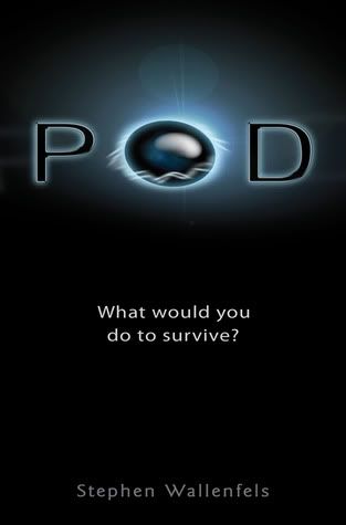
Ninfa: This is a UK win. I love the slick and elegant cover, it's so modern and sci-fi. The Aussie version is a little too busy for me and I don't like the POD title font and colour.
UK wins.

Which do you prefer?

3 Nov 2011

POD Review

POD by Stephen Wallenfells
Available now

What's it about?
POD's - strange alien spheres hover menacingly in the sky, zapping anyone who ventures outside.

Josh is 15 and stuck in his house with his OCD dad. They're running out of food... Megs is 12, alone and trapped in a multi-storey carpark. The hotel next door is under the control of dangerous security staff, but Megs has something they want, and they'll do anything to get it...

When the aliens invade, the real enemy becomes humanity itself.

What would you do to survive?


My review:
4/5
I started this without knowing much about it other than it involves an alien invasion but since I'm realli interested in astronomy and aliens (yes I believe!) I was really excited and I wasn't disappointed. I really enjoyed this book, yes this involves aliens but that's not really what it's about. It's about humans and what we'll do to make it, what would we do if we were suddenly house bound (or car park bound in Megs' case) with only the supplies we already had to survive?
The chapters switch off between Josh and Megs both of whom are very different characters in very different situations, both of whom I really liked.
Josh is has a bit of a defeatist attitude but he's funny and there were some one liners in the book that really had me laughing, he goes a little stir crazy stuck in his house with only his Dad and dog for company and the ways he entertains himself time were amusing.
Megs on the other hand is only 12 and finds herself alone and with some not very nice men, she's extremely brave, clever and resourceful and does a terrific job at outwitting them all.
I did find the book slightly slow paced in parts but it was still exciting even if it didn't have my heart racing, I was glued to it and finished it in one sitting despite the fact I had to keep waking myself up because I was so tired. There are some really sad parts that made me feel for the characters.
There is, however, no explantion at all for the aliens, but then I guess it's hard to put one in when the characters we're following are completely cut off from the world with no phones, tv or radio but I've done some digging and there is a second book so hopefully there will be explanations there since the book was also ended pretty open with a hint of things to come so I can't wait to see what happens next.

My thoughts on the cover
I do like this cover, it's plain and simple but it has an eerie feel to it because of the what's going on with the 'O' Before I read the book that was certainly something that intrigued me, was it a spaceship? Or something even more sinister. Now, of course I know but I won't spoil it for you :)

Favourite quotes

Alex is lucky. He lives in a duplex next to the apartment building across the street. Which means there's a POD right over his house. Which means he's lucky because he can't see it. I, on the other hand, am not lucky. - Josh.

I have something better to do. Like looking at the cul-de-sac, at the bike that's always there, the POD that never moves or sleeps, the girl who should be in the window but isn't. so instead of saying yes, I set down the binoculars and say, "What happens when the food runs out?" - Josh.

Related Posts Plugin for WordPress, Blogger...